SEEING-[:like]->a DIAGRAM
I started 2018 by running a workshop at the MA Graphic Media Design, London College of Communication, as part of a series around the theme of Leakage which included Ruben Pater, FRAUD (Audrey Samson & Francisco Gallardo), and Marwan Kaabour.
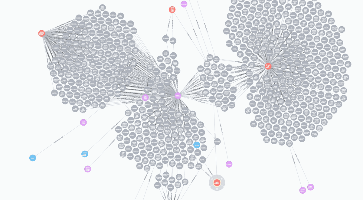
image: a subset of the Panama Papers database in Neo4j Browser.
Brief: [PDF: 169KB]
Project Reader on Are.na
My way into the theme of Leakage was through graph databases, specifically Neo4j, the database used by the International Consortium of Investigative Journalists behind the Offshore Leaks such as the Panama and Paradise Papers.
Graph databases are a way of storing data as nodes and edges, they are particularly suited to social network analysis and a range of use cases such as recommendation engines or fraud detection. The Offshore Leaks have become a poster story for this otherwise mundane form of data storage; one where technology enables journalists to uncover the dealings of the rich and powerful.
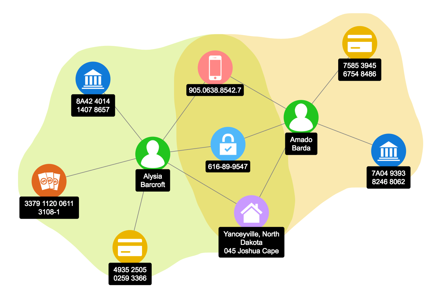 Fraud detection example using Neo4j and Zoomcharts.
Graphs are often vast and very complex–the Panama Papers database, for example, has 1.040.535 nodes connected by 3.071.104 relationships–yet their structure is easy to grasp compared to relational databases which link data through multiple tables. I was curious about what graphic designers would make of these diagrammatic data structures; especially of Neo4j as it features a visual browser and the Cypher language, an ASCII-art syntax for queries written as small diagrams.
MATCH (o:Officer)-[:BENEFICIARY_OF]->(e:Entity)
return o, e
An example Cypher query
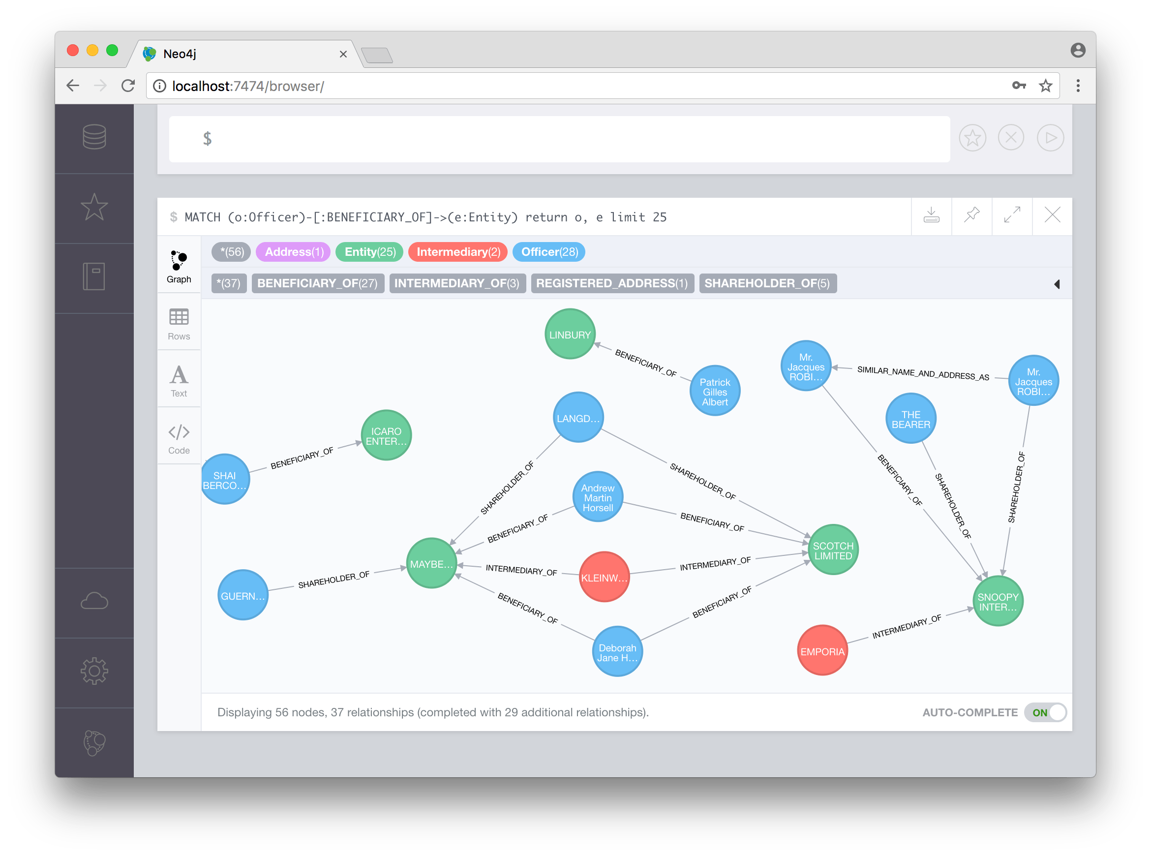 The Panama Papers database in Neo4j Browser.
The workshop was about borrowing this ‘way of seeing’ through graphs and applying it to subject areas chosen by the participants. Graphs have the potential to be both reductive and generative; on the one hand, they see the world only through nodes and links, on the other, they reveal new, hidden, or surprising connections. The brief was about negotiating with these possibilities and looking for creative opportunities. The spectrum of suggested approaches to the brief was delimited by “critical investigation” at one end and “speculative imagination” at the other. In other words, the graphs were not an end in themselves but grounding for critical practice and discursive projects, with the aim to either unpack, comment on, or propose alternatives to, existing ideas, systems, and narratives. This process took place in two phases:
First participants chose an area of interest and set out to map it using a graph. I briefly introduced Neo4j, but teams were free to use other means to construct their graphs—such as collaborative drawing tools or physical pinboards. Since the Neo4j browser doesn’t allow for visual editing without writing code, some teams used APC Jones’ Arrows tool to build their graphs visually. Each group designed ways of finding, accumulating, and systematising data into a graph. This was a labour intensive process which prompted reflections on the act(s) of “actively taking” information—what Johanna Drucker calls capta, as opposed to data which are “assumed to be a ‘given’ able to be recorded and observed.”1
Slide by Wesley Goatley
The second phase was about designing interventions and proposals. These were drawn, extracted, or otherwise inspired by the graphs, whether directly querying a database or more loosely. The graphs themselves were treated as an outcome in their own right, to be submitted separately. This meant that this phase was explicitly not a graph/data-visualisation exercise. While network visualisations have proven useful, for example in the forensics of twitter bot networks, they often turn into “hairballs” or “spaghetti bowls”2. Instead, this part of the workshop was about design which was informed by the graph, but the terms of this translation were up to the participants.
Below are summaries of the different projects and some selected visual outcomes.
Crisps
Team: RuiQing Cao, Huancui Chen, Qianxian Chen, Ruiqi Chen
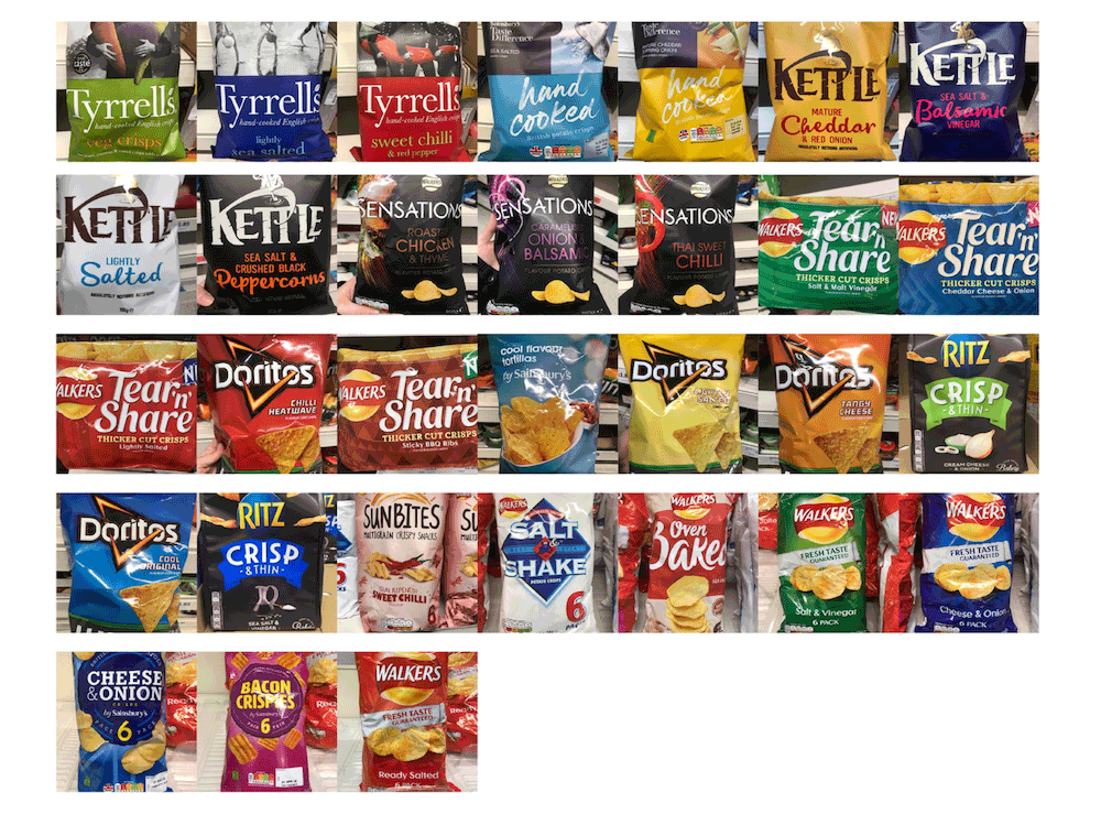
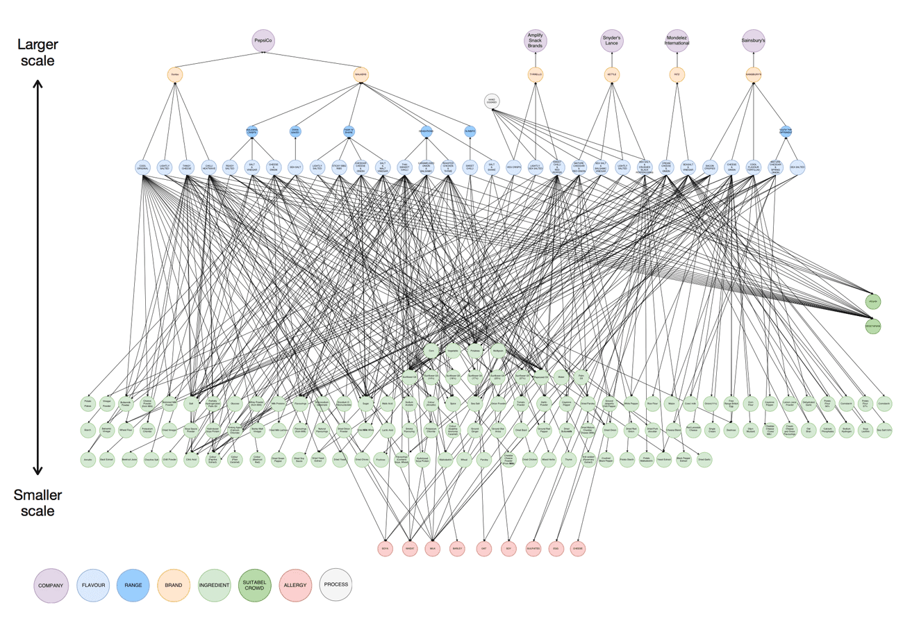
Graph: Ingredients from a sample of 31 types of crisps. The graph goes from the macro-scale with the industrial groups to which the crisp brands belong, to the micro-scale with the chemical compounds found in each of the products.
Tool: draw.io
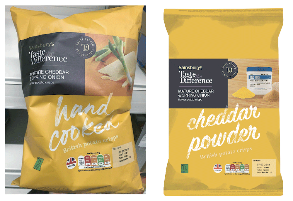
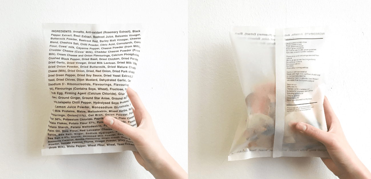
Interventions: Packaging designs which highlight the gap between marketing language (“natural”, “hand cooked”) and the actual ingredients found in crisps. These were experiments in foregrounding what is usually hidden in the ‘small print’ of processed foods.
Oil Trust
Team: Chi Kit Chan, Wei Dai, Helen Taranowski, Shuang Zhou
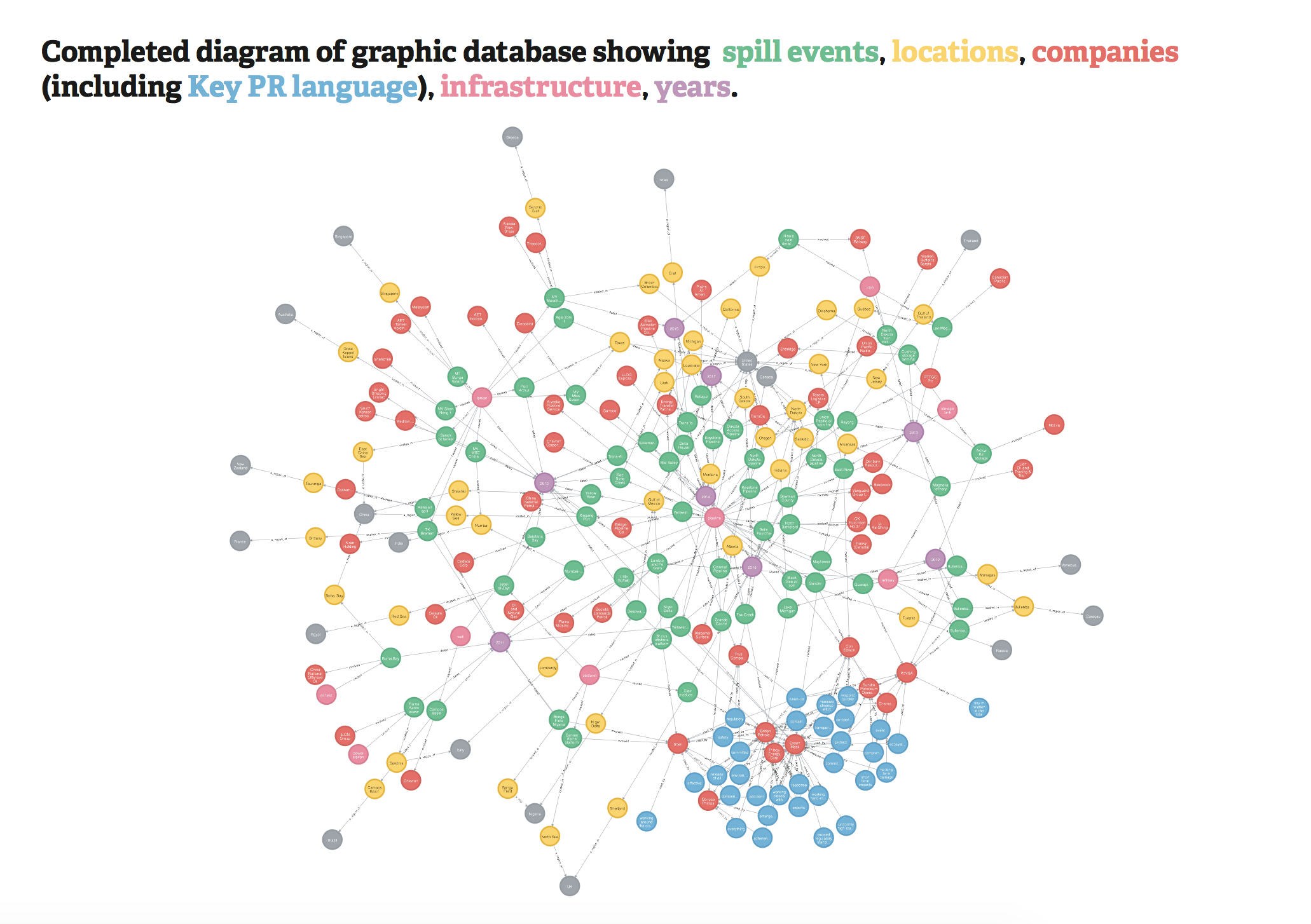
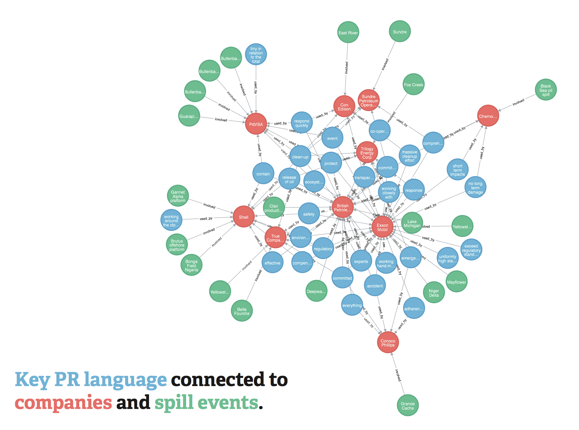
Graph: The locations, companies, and infrastructure involved in 61 oil spills. As the group narrowed their focus to the public relations ‘management’ of these disasters, they attached elements of PR language to some of the events and companies.
Tool: Neo4j
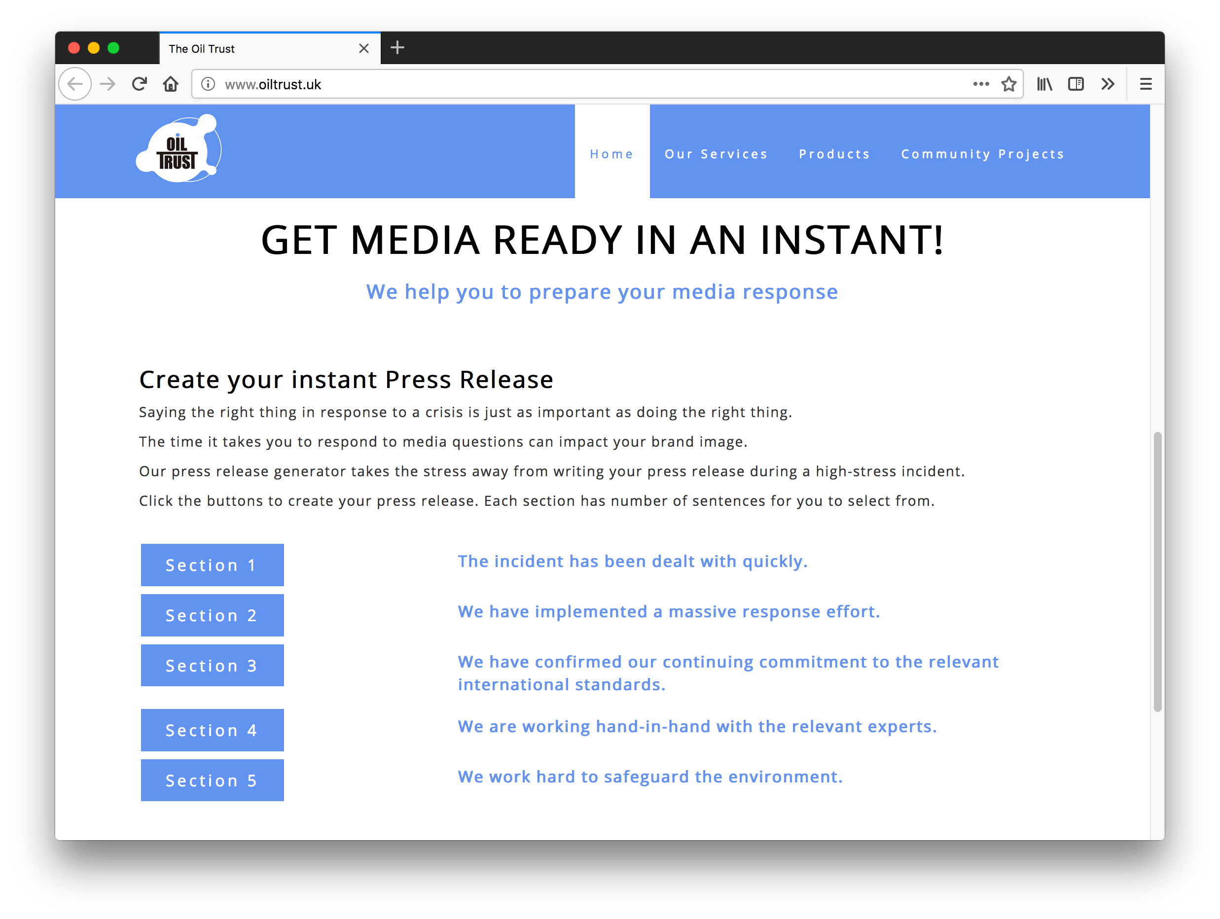
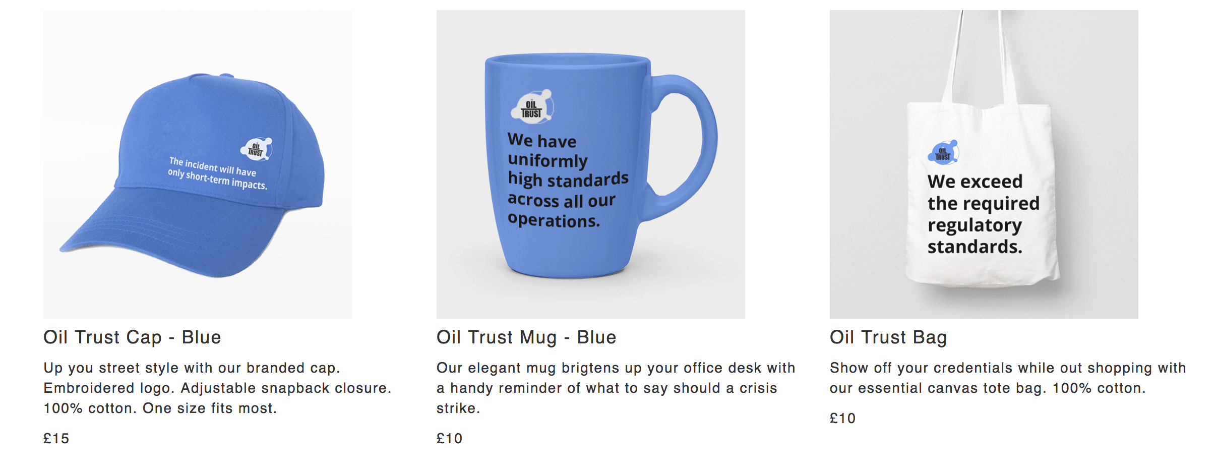
Intervention: Oil Trust, a satirical PR firm specialising in oil spill crisis management. Includes a press-release generator, merchandise store, brochures, and social media accounts.
Art Riot
Team: Xiaoxuan Guo, Rong Tang, Xiaoquing Wang, Hao Zhang
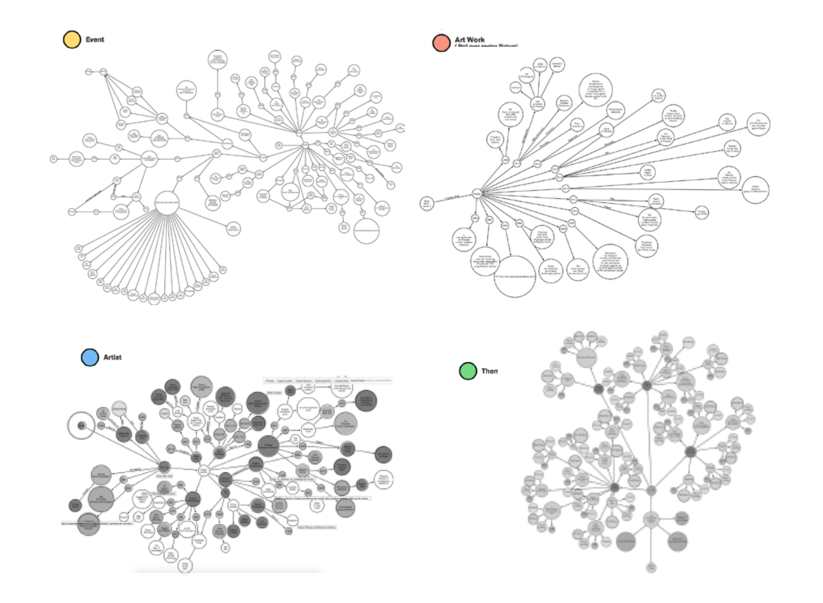
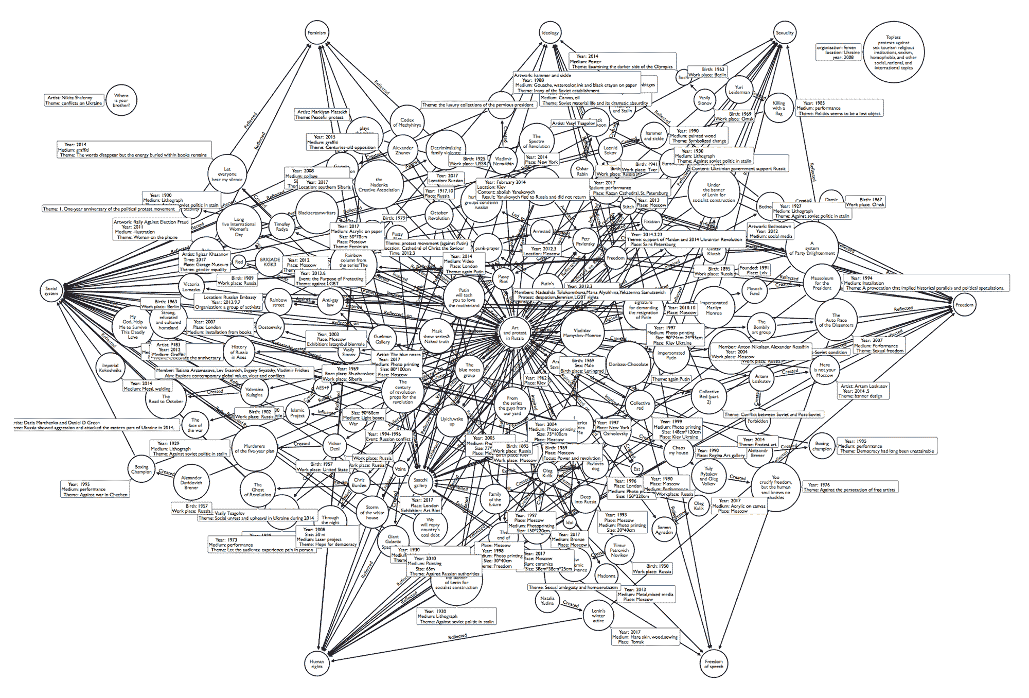
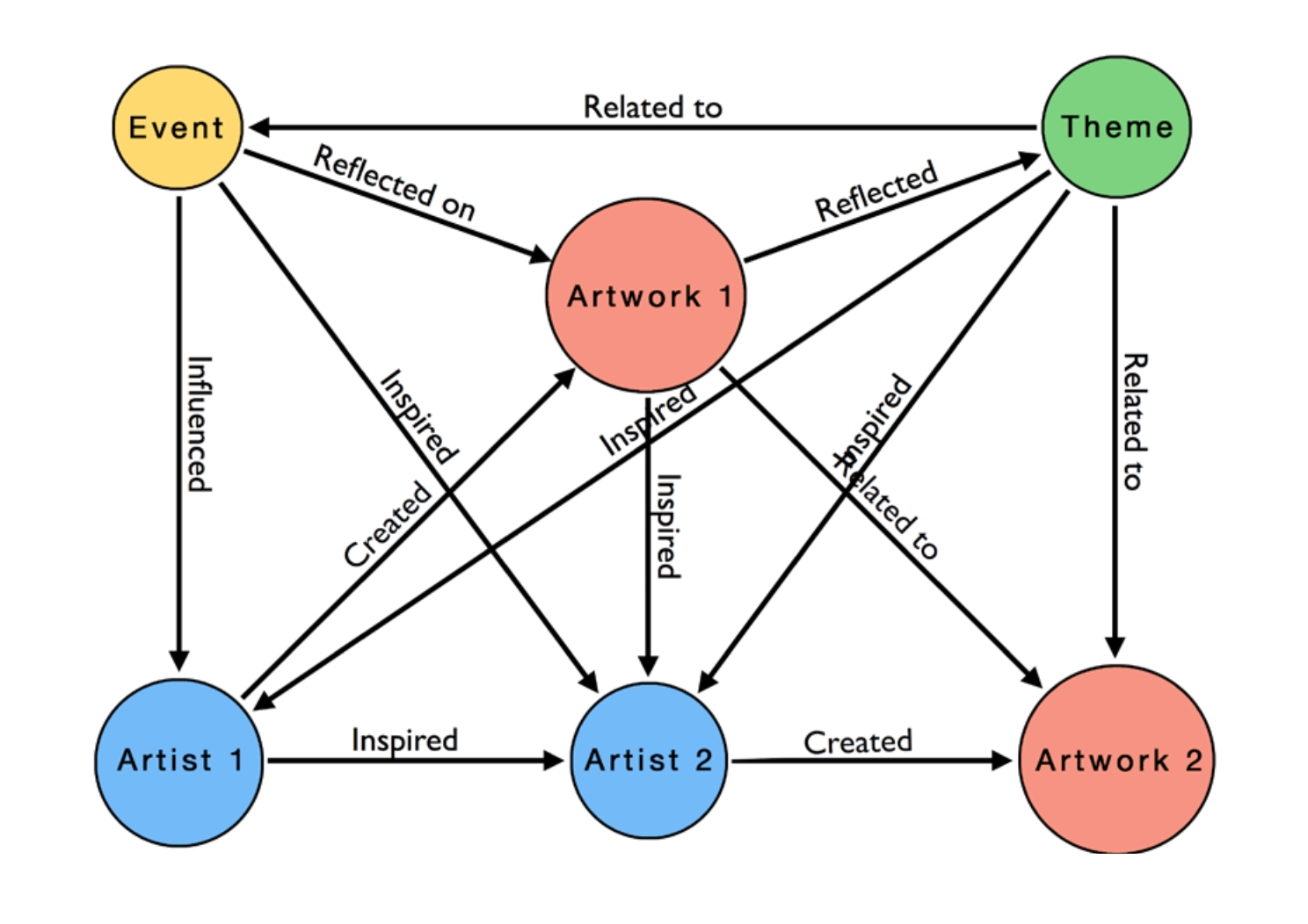
Graph: Relationships between artworks, artists, news events, and broader social themes in Russian activist art, focusing on the Art Riot exhibition (Saatchi Gallery, 2017).
Tools: Arrows, Drawings
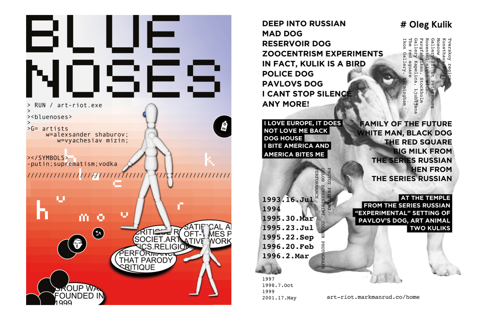
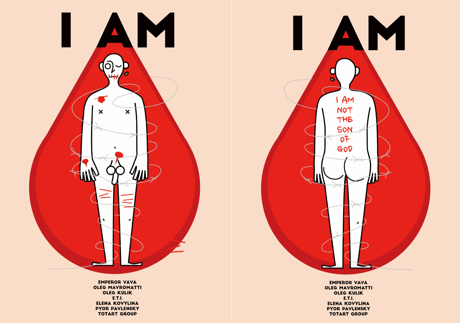
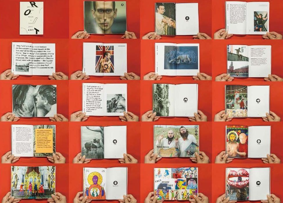
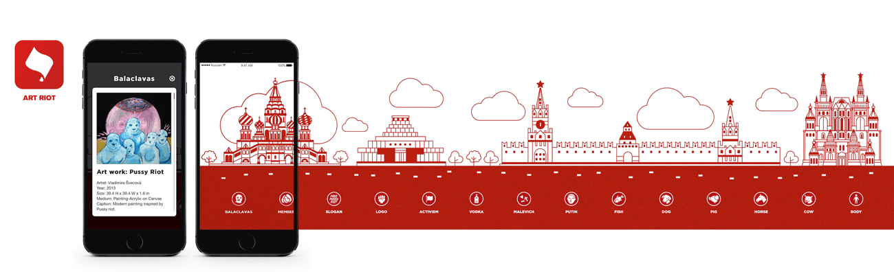
Interventions/Proposal: A series of tributes to Russian artists/activists, and a new graph-based way of curating art exhibitions and books through common themes or visual elements. This was explored through a web-app prototype and a publication.
Code of Arms
Team: Aadhya Baranwal, Sui-Ki Law, Clara Wassak, Shengtao Zhuang
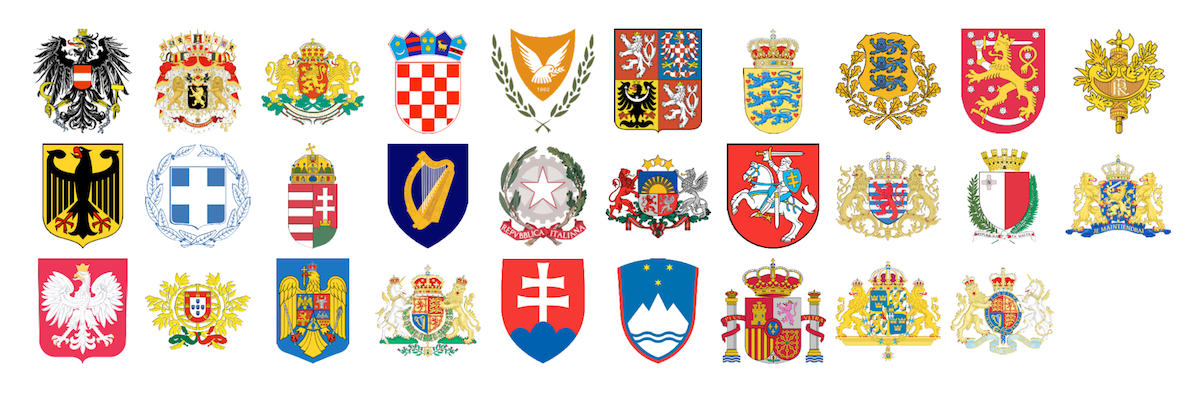
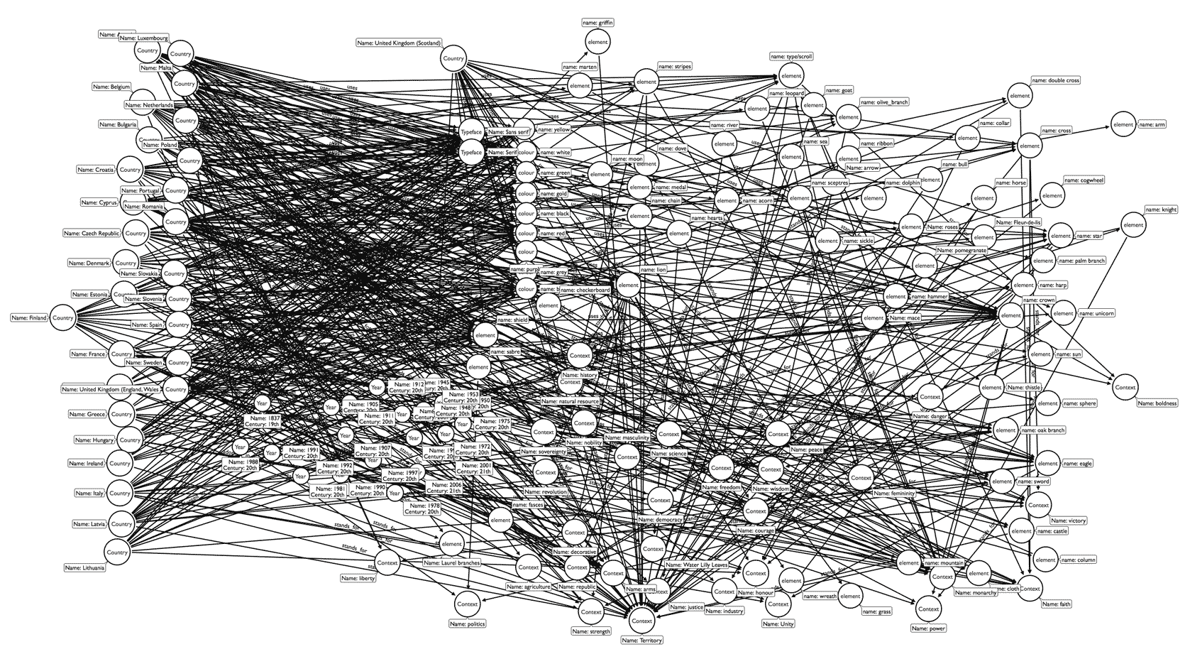
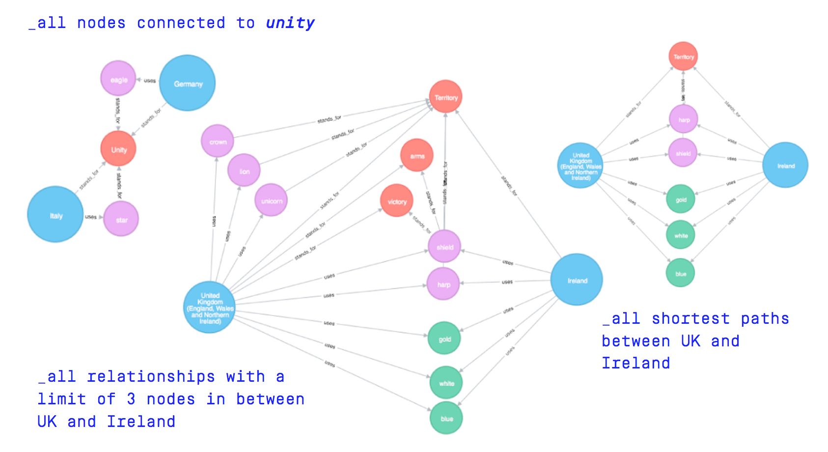
Graph: The symbols, colours, and typefaces used in 29 heraldic emblems for EU countries (28 + Scotland), as well as their semantic meanings.
Tools: Arrows, Neo4j
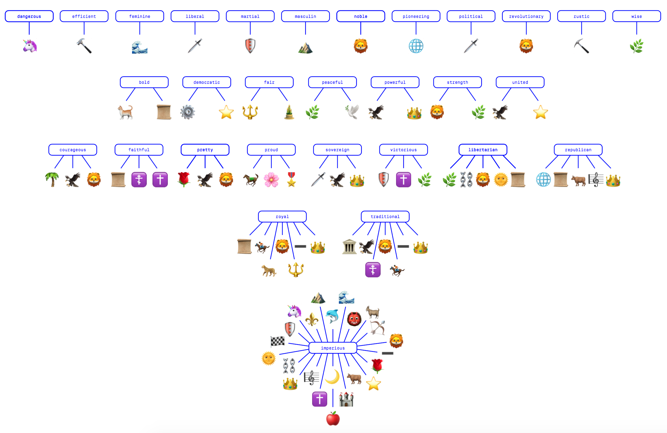
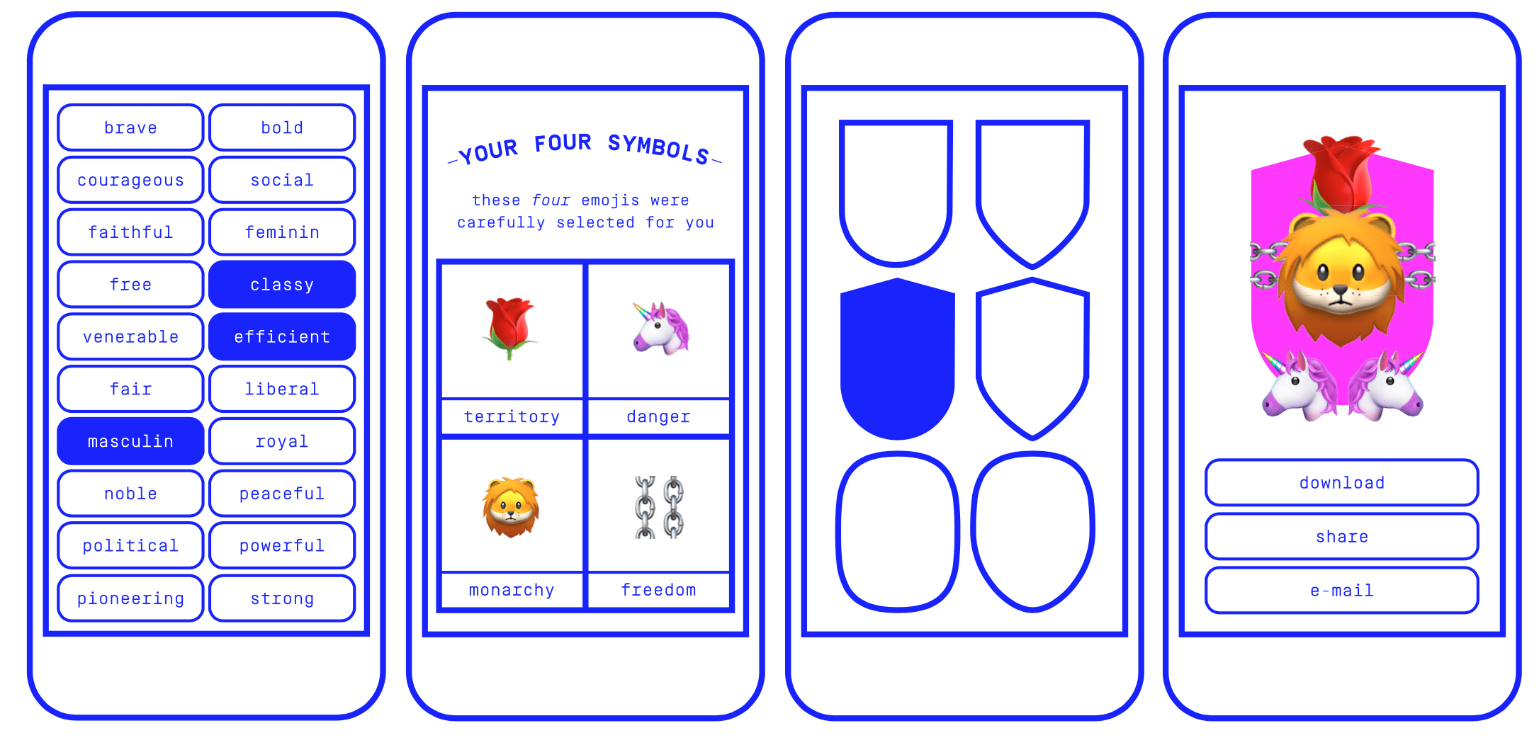
Proposals: A re-interpretation of the semantics of EU national heraldry using emoji, as the basis for a personal emblem generator (see the prototype). This is one of a series of experiments which used the graph as a generator for new emblems; for example for the whole of the EU, or for “unifying” two nations such as the UK and Ireland.
I won’t attempt to draw general conclusions from such a diverse set of subject areas, outcomes, and ways of working. If anything, what runs through these projects is the tension mentioned earlier between the systematic graph, a reductive form of data storage (as they all are), and the generative graph, a map which invites a multiplicity of readings. I was genuinely impressed with how the participants took ownership of this open-ended brief, with the fascinating and challenging subjects they chose to investigate, and with the work they produced.
A series of events based on the Leakage workshops will take place at the Design Museum in June 2018 as part of the Hope to Nope exhibition. The ideas and work presented here will continue there in another, yet to be determined, form.
Huge thanks to all of the participants for taking part and working hard, to Paul Bailey for inviting me to give the workshop, and to Georgina Voss for her feedback on the projects during the final presentations.
Drucker, J. (2011) ‘Humanities Approaches to Graphical Display’, DHQ Digital Humanities Quarterly, 5(1). [link]↩
Bounegru, L., Venturini, T., Gray, J. and Jacomy, M. (2017) ‘Narrating Networks. Exploring the affordances of networks as storytelling devices in journalism’, Digital Journalism. Routledge, 5(6), pp. 699--730. doi: 10.1080/21670811.2016.1186497.↩